Lucky Eggs — Logo Design Story
The Brief
Lucky Eggs is a prominent wholesale and retail egg distribution brand in Sangli, supplying fresh farm poultry products to supermarkets, bakeries, and local retailers.
The objective was to replace generic egg packaging with a distinctive, consumer-friendly brand mark that builds instant recognition across transport crates and retail outlets.
The Thinking
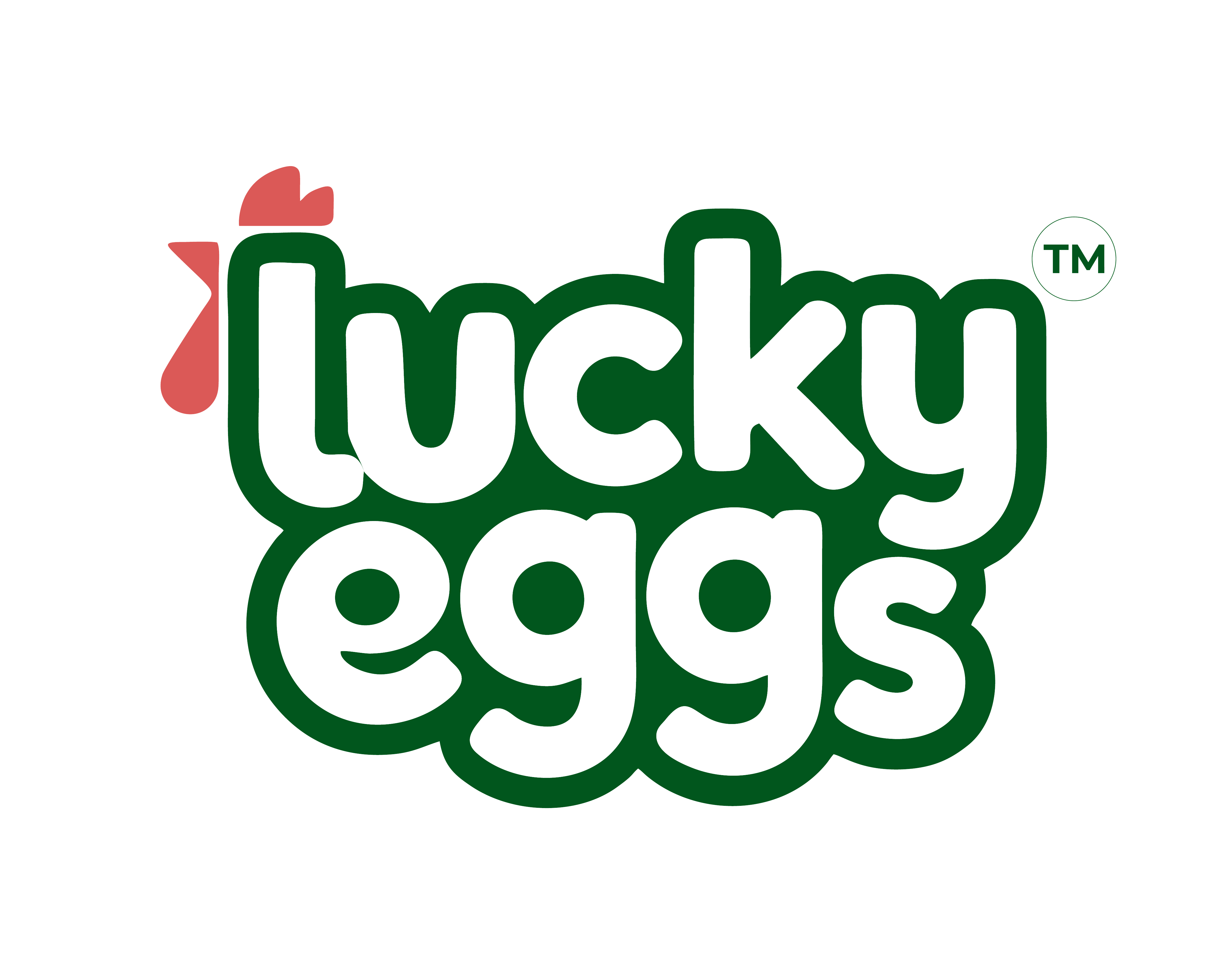
We crafted a playful yet professional typographic emblem. The wordmark features heavy, rounded letterforms that evoke the natural smoothness of an egg, while the initial letter ‘l’ seamlessly integrates a stylized rooster comb and wattle in vibrant coral red.
Enclosing the mark in a solid green badge ensures maximum contrast and quick brand recall from moving delivery vehicles.
Color Palette & Typography
Custom rounded display lettering with soft terminals and consistent stroke weight designed specifically for poultry trade visibility.
The vibrant green and coral red scheme establishes an immediate connection to organic farm health, while white letters ensure clear readability.
Storefront & Vehicle Fleet Touchpoints


From wholesale delivery vans and backlit retail signboards to farm carton labels, the logo maintains high visibility and friendly appeal across Sangli's distribution network.
Logo and brand identity designed by Graphic Galaxy, Sangli for a consistent and professional brand presence.